history_edu
:format(webp):no_upscale()/cdn.vox-cdn.com/uploads/chorus_asset/file/19651078/Un_Pueblo_de_Nada___Emily_and_Rita_On_Set.jpg)
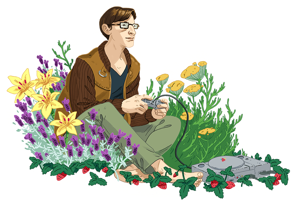
"How the creators of Kentucky Route Zero ended their seven-year saga"
Polygon: Feature Story
I spent an evening with Cardboard Computer to learn how their “game in five acts” came together just as it was ending, and how the trio stuck together as friends and artists to see it through on their own terms.
history_edu
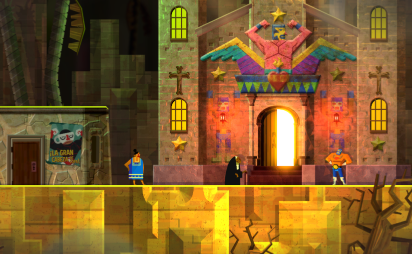
"The World of Guacamelee! 2"
Engadget: Feature Story
How do you follow up a near-perfect game? Drinkbox Studios shared their approach with me by celebrating what got left behind in Guacamelee!, and by engaging players with the deeper colors, stories, and cultural touchstones of Mesoamérica.
history_edu
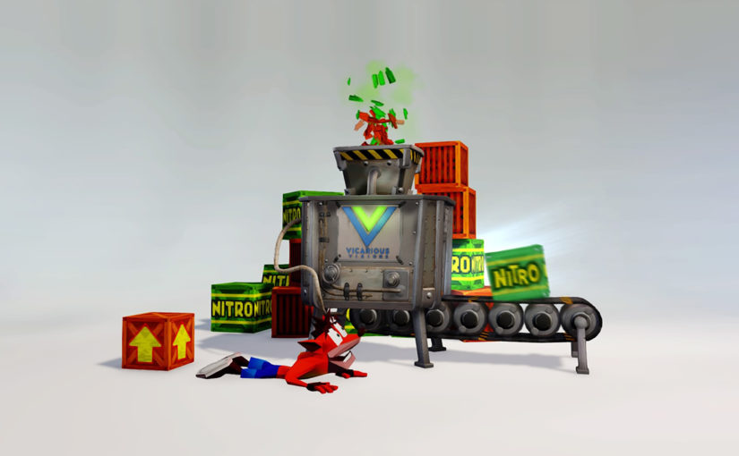
"The (re)making of Crash Bandicoot"
Engadget: Feature Story
Key artists from Vicarious Visions walked me through their approach to remastering Naughty Dog’s iconic PlayStation trilogy, and how they handled inheriting a legacy with millions of nostalgic fans.
history_edu
:format(webp)/cdn.vox-cdn.com/uploads/chorus_image/image/54462143/The_Last_Guardian__20170212211737.0.jpg)
"The Last Guardian contains a beautiful lesson about animals’ ability to forgive"
Polygon: Opinion Piece
In this very personal story, I wrote about my experience with Team Ico’s long-awaited epic as it intersected with a beloved pet’s passing. To help me unpack the game’s messages about how we interact with animals in need, I also spoke with local wildlife experts on the subject.